GDC Day Two: All The Summits
April 3rd, 2018
Day Two of GDC meant more Summits including Indie, Narrative, Board Game and Level Design. This also meant I was running around like a crazy person most of the day jumping from hall to hall. In between that though I was able to write down some notes.
I was especially looking forward to the talks about 'Tacoma', 'West of Loathing' and 'What Remains of Edith Finch' as these were some of the best games I played last year. Given the diversity of content the talks covered, it really showed how much the narrative-driven and exploration game genre has expanded.
Designing for Non-Linear Story Discovery in 'Tacoma'
Steve Gaynor and Nina Freeman, Fullbright
Watch the full talk on the GDC vaultThe talk started by covering the goals of ‘Tacoma’ and how the team wanted to tell a story mechanically and environmentally. This meant that the audience can take their own path, but can only be in one place at a time, building up particular parts of the story into the full thing.
The initial approach to the narrative was similar to the ‘pearl’ structure of games like 'Bioshock' or 'Gone Home' where bits of content - this case augmented reality scenes - were strung together through the level. Along the way the team also experimented with sequences that flowed through the environment in a way the 'audio diary' structure did not. This approach resonated with the team and as a result they dediced that the whole game should follow this approach.
An impact of the new setup was that the team had to think about Level Design differently to support these non-linear segments. As the narrative elements became larger and more complex, this had a huge dependency on the level design which was reshaped to embrace this non-linear approach.
In terms of implementation, Nina talked about how she iterated quickly on paper. She saw the station itself as a utilitarian space with each area housing a person who had a job to do. These areas had to tell the story, but also support the functional aspects of the person’s job.
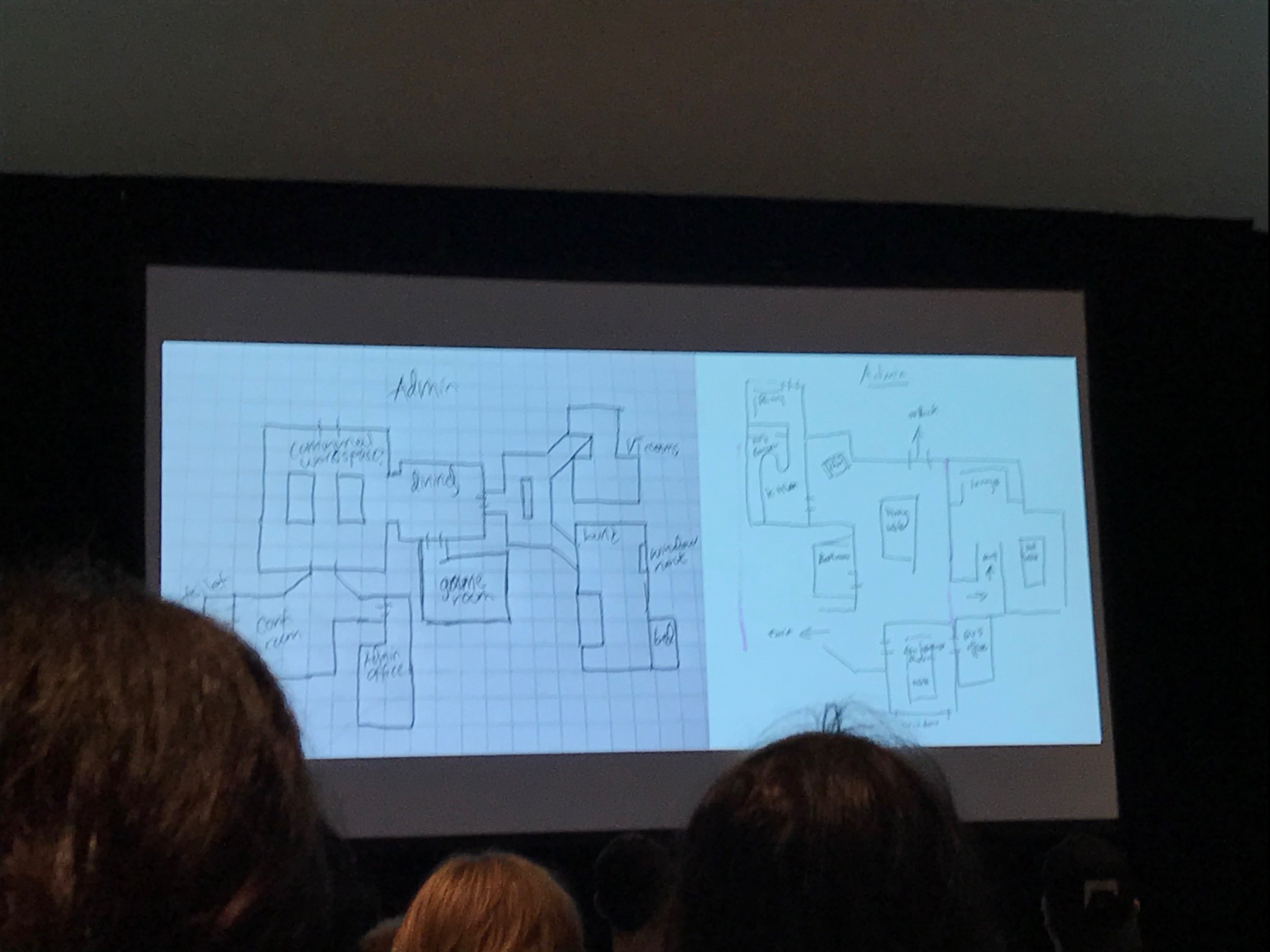
Along the way she would ask: How can people use rooms realistically, or how can we make the space tolerable? As a result, spaces became more compact and corridors were removed. This leant itself to the idea of there being no wasted space, and work areas became separated from private areas.
The result was a hub and spoke structure. Central hub spaces allowed the narrative scenes to play out naturally, intersecting and flowing into each other. Personal spaces allowed for private moments between characters.
One gameplay system in particular supported the non-linear narrative while also creating a sense of progression: the USB. Players had to go to each area to sync data to the USB. The slow speed of the sync forces players to explore, giving them the room and time to do so. Completion percentage increases based on interacting. Go away, watch scene, come back and see progress.
Invisible Intuition: Blockmesh and Lighting Tips to Guide Players and Set the Mood
David Shaver, Naughty Dog
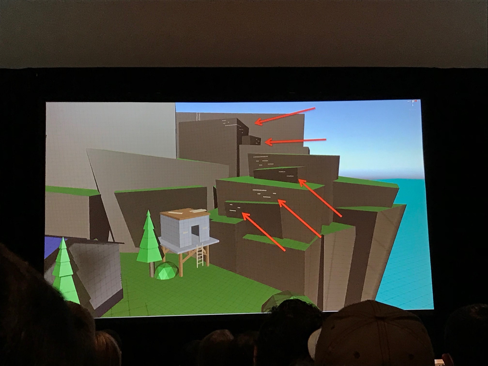
Watch the full talk on the GDC vaultIn a talk that could have been alternately called “The UX of Level Design,” David started with a definition of 'blockmesh'. This is a term used at Naughty Dog, but is also known as whitebox or graybox. The difference however is that blockmesh also included colour and lighting.
The goal of the talk was to provide a rulebook for designers to follow when building their blockmesh, and I’ll (try my best to) summarise the key points.
- Affordances: Players should clearly understand what can be interacted with and where they can go, just by looking at the level. Consistent rules are important for this, and should be included at the blockmesh stage. Additionally, this should show what cannot be interacted with. Playtests should be used to identify and record issues with affordances – or bad jumps – where failed interactions occur.
- Visual language: This can be used to guide players in the right direction. Naughty Dog have used the same consistent rules when designing levels: spikey objects indicate danger, rounded objects are safe, and square objects are stable.
- Landmarks: Seen from far away and from vantage points, these provide a goal for the player to work toward. They should be unique if there are many similar objects. David recommended building the level backwards from landmark.
- Openings: These attract players and create an air of mystery.
- Gates and Valves: Gates stop progress until conditions are met. Valves prevent backtracking, e.g. dropdowns
- Leading Lines: Use composition to draw the eye in a certain direction. Ropes, pipes, cables
- Pinches: Layout funnels the player to a certain direction. Good for redirection and reveal setup, such as landmarks.
- Framing and composition: Draws attention to make stand out. Combine with pinching.
- Breadcrumbs: Lead player to goal, e.g. enemies, lights, pickups. Leave out of early blockmesh as they can disguise layout flaws.
- Textures: Point the way to goal, e.g. arrows, scrapes on walls.
- Movement: Used to grab attention, e.g. scripted moments, VFX, birds etc. Try to include these in blockmesh before locking down, but not too early.
- Light and God Rays: Players are drawn to light sources. This can be used to highlight important items or areas.
The final tip was to make use of the ‘Squint Test’. Squint at your level and see what stands out. Things that stand out will be seen by players. Use this to validate that the right things stand out.
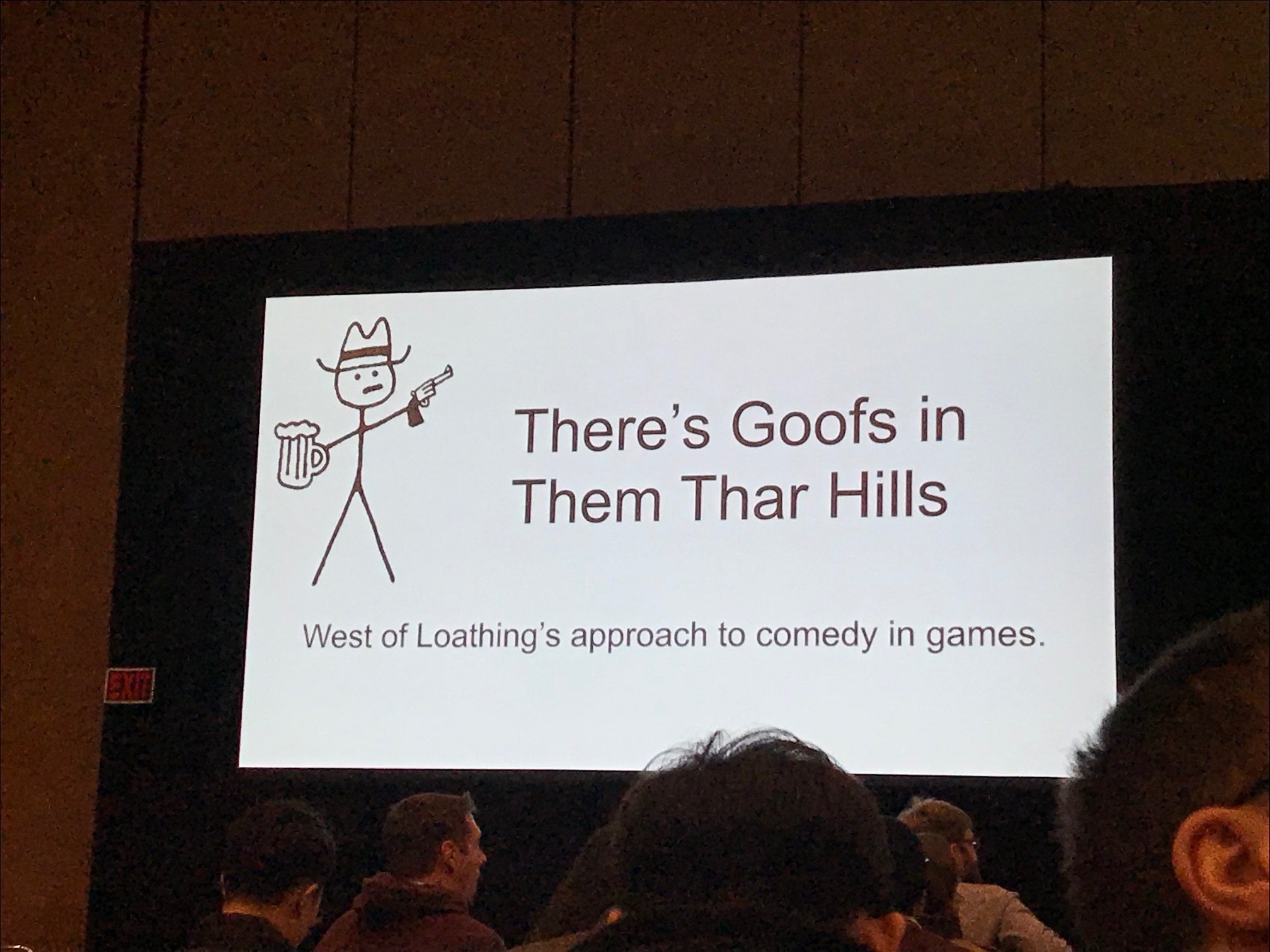
There's Goofs in Them Thar Hills: The 'West of Loathing' Approach to Comedy in Games
Zack Johnson, Asymmetric
Watch the full talk on the GDC vaultOne of the funniest games of last year was ‘West of Loathing’, a western RPG game with a cast of stick figure characters. Zack kicked off the talk by mentioning something important: ‘West of Loathing’ is a comedy game, not a game with jokes in it, and the systems and tools should serve this purpose.
Providing a postmortem of their process, Zack discussed their decision to make the narrator a character in their story. This allowed the writers to talk directly to the player, which not only made writing fun, but also allowed them to poke fun at flaws in the game. Additionally, they could give cues to the player about how to feel, or what they could do next, without ever directing them.
He also covered how they approached writing for non-playable characters, thinking about how they talked, how much they can put up with the player, their goals, and how they feel about being interrupted. This allowed them to provide personality to their wide array of characters.
During development the tools supported the team, allowing them to get as many jokes in as possible with little tech dependencies. Zack made it clear: “Don’t let quality get in the way of jokes – a joke is better than an expensive system that isn’t a joke.”
In terms of things the team didn’t do, top of the list was letting gameplay get in the way of jokes. Because of this, the game was deliberately not challenging, though Zack did admit they ran out of time to improve the combat systems.
When it came to the writing, there were areas the team were conscious of staying away from including dealing with topical subjects, using jokes from other media, or making fun of things people didn’t choose. That meant a few Trump jokes ended up on the cutting room floor.
Board Game Design Day: Cardboard Interfaces: UX for Board Games
Randy Hoyt, Foxtrot Games
Watch the full talk on the GDC vaultRandy’s talk focused on how UX principles are applied to table top games. He argued that, like digital products, players are interacting with abstract underlying rules. But boardgames, unlike digital products, have no systems to enforce those rules. Because of that, players need help to keep them on track, and UX can help with this.
Examples included Settlers of Catan which comes with a reference card for the economy to help with learnability and memorability, or even playing cards which include iconography in the top-left corner to improve player efficiency.
The talk concluded by going through Randy’s design process, taking a game from concept into prototyping to identify issues and begin finding solutions, before finalizing the artwork.
Foolproofing the Controls for 'What Remains of Edith Finch'
Evan Rogers, Giant Sparrow
Watch the full talk on the GDC vaultIn ‘What Remains of Edith Finch,’ players connect to the story through their inputs. As Evan discusses in his talk, there were a lot of challenges to this. How could players discover the controls without being told? How could they still feel like they had control? How could players perform their role in the story?
From the start, the team found that discoverability was difficult. The opening scene introduces players not only to the game, but also to how it should be played. There are no prompts on what to do, with players often confusing the first scene with a menu screen in playtests. Evan noted that they could have added prompts to guide players as to what to do, but instead they stuck to their initial goals to encourage players to discover. This helps players learn exactly what is expected of them.
In terms of goals for the controls, the team stated that they should be easy to discover; they should require minimal attention from players; feedback should match the input as closely as possible; the controls should maintain the pacing of the game; they should look natural; and they should leave some freedom for players to experiment.
One example Evan used was that of Lewis’ Story at the cannery. Here the player uses the left stick to control the character and the right stick to cut fish. To prompt the player at the start of the vignette, the character’s hand is shown on screen, and the narration is paused until the player interacts. As the sequence continues and new controls are introduced, fish temporarily stop spawning to help ease the player into it.
One choice the team had to make was whether players would need to grab and release the fish. In the end they decided to make this interaction automatic – while it meant there was less freedom to play and the inputs matched less directly, it required less attention from the player and better fit the story they wanted to tell.
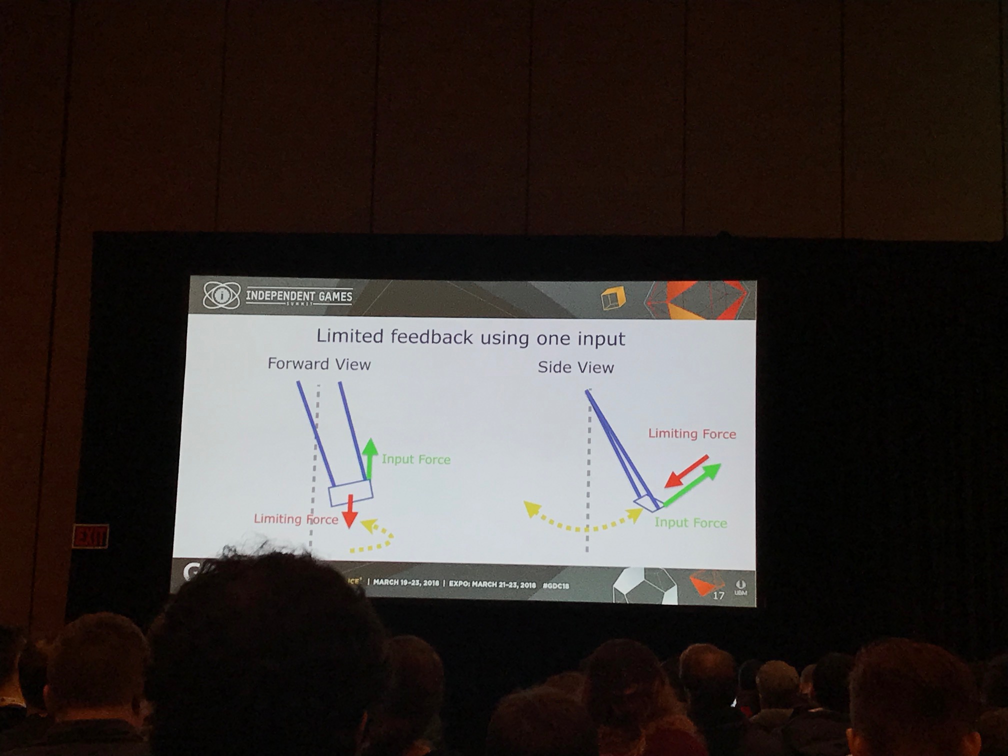
Another example was Calvin’s Story on the swing set. The goal here is for the player to swing both legs in order to gain momentum. These are mapped to each of the analog sticks, the first time the left stick is used for something other than camera movement.
When playtesting, they found that players would often only move the right leg. To provide feedback, the team added physics to the swing so that it would twist and unbalance if the player moved only one leg. The trajectory corrects itself when two legs are used, and momentum increases quickly. Once enough momentum is gained, the input timing between the two legs stops mattering. This allows the narrative to synchronize for all players.
The final example used was Gregory’s Story in the bathtub. This example highlighted how important it was that gameplay was effortless in order to convince players to continue, knowing what that would result in.
In this vignette the player has to control a magic frog. The biggest challenge was the character (and thus camera) placement as it made it hard to judge depth. To account for this, generous goals are provided to make gameplay easier, requiring little effort or mental load. The team also increased collision zones on bubbles to make it easier for players to hit them with the frog.