GDC Day Three: Onto the Conference
April 4th, 2018
It's now time for Day Three of GDC which means the full Conference began, along with the Expo. Wednesday's schedule looked great, and there were often multiple talks in the same timeslot that I wanted to attend. Three of the talks I went to also happened to cover some of my favourite games of 2017, so I had to contain my inner fanboy while taking notes.
I also managed to find an hour to wander around the Expo which was crazy. There were loads of people and plenty of interesting games to check out - including one where puppets acted out gameplay as you played! Fortnite fever had totally taken over most of the South Hall too, with people lining up to ride the mechanical Llama (which might explain the image above).
Omer started off his talk by saying that UI is the visual branding of your game. When it comes to UI, there are two major components: the Head’s Up Display (HUD) which is context based, and the front-end which is concerned with navigation, information architecture and structure.
The first part of the talk gave a high-level overview of the goals of UI. It should be visually pleasing while still being usable. When designing for console, touch inputs and controllers affect design directly. So too does human perception. The biology of the eye and how we parse information are all important factors in UI. Fortunately, there are guidelines for this. Gestalt Theory helps us understand how humans perceive objects, and Usability Principles help us understand how they process information.
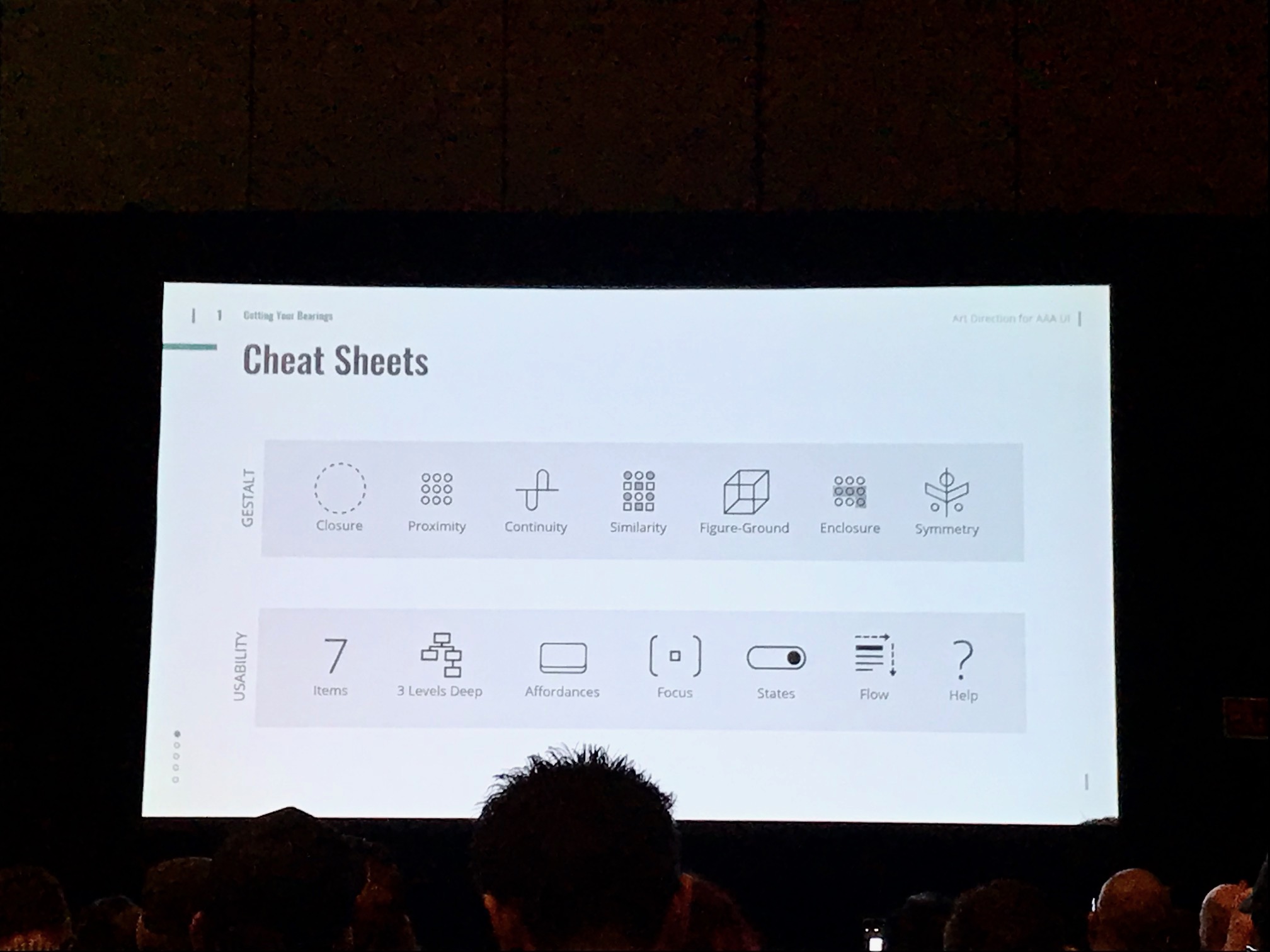
When it comes to designing UI, it should help establish hierarchy, flow, and consistency. This applies to both front-end and HUD. Considerations such as aspect ratio need to be thought about, as too do keeping a safe frame around the elements, using negative space, and alignment and anchoring UI elements help to make it look good no matter the screen size.
Typography is also important to consider. Both in terms of legibility and readability, but also the branding and tone of the game. Also be aware of optimal line length (60-120 characters per line) and localization requirements (roughly 40% extra space to account for other languages). The 6FT rule is important to consider – this is the average distance from sofa to TV. Text should be readable at this distance.
In terms of executing the UI, Omer usually creates mockups in Adobe Illustrator, Photoshop, or After Effects depending on the needs. He also recommended starting with key screens such as the title screen, front end, server and lobby, customization screen, HUD, and results. This helps capture the feel of the UI.
'Dream Daddy': How Game Grumps Created Player Inclusivity and You Can Too
Tyler Hutchison, Game Grumps
Watch the full talk on the GDC vaultDream Daddy was a game filled with big dreams, and was able to add inclusivity with minimal scope increase. Tyler’s talk covered some key ways you can also make your game diverse.
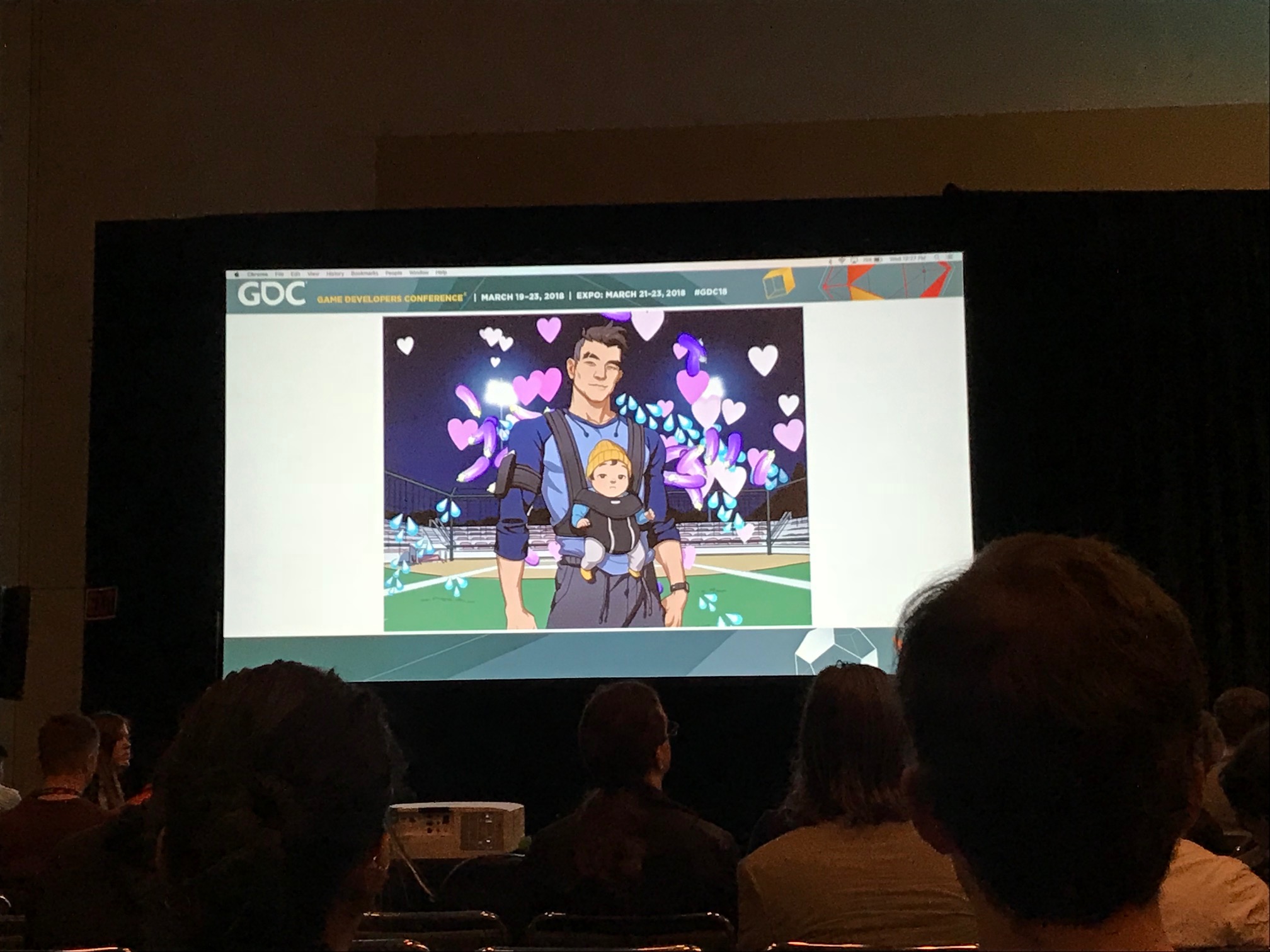
Starting with the obvious, Tyler mentioned that the first step to making a diverse game is to have a diverse cast. Extending this, they added a Character Creation Tool (something not usually part of dating sims or visual novels) as players could get more invested in the story, it was another opportunity to create representation in the game, and they’re fun to use.
The team wanted to keep the Creation Tool simple however, and work within their means. There are no sliders, only discrete choices. They also limited choices in some instances, such as body type, but offered a diverse range to be representative. They also made use of a preset colour palette which allowed for a wide range without offering every option.
In the narrative they allowed players to fill in the blanks for their character. These choices allowed the player to make decisions about their sexuality and relationships while still keeping options open and not forcing categorisation.
When it came to writing narrative, they enabled their team with tools. Alongside traditional tools, their programmers also built a compiler to allow them to generate scenes based on scripts – denoting emotion in text displayed the correct character for instance. The team also worked hard to remove gendered pronouns. This was something that was easy to fix, and also created richer dialog.
Tyler ended the talk by discussing a four-hour investment they made by adding the option for players to select a binder in the Character Creation Tool. This was an easy thing to add, and the outpouring of positive feedback from trans players was overwhelming.
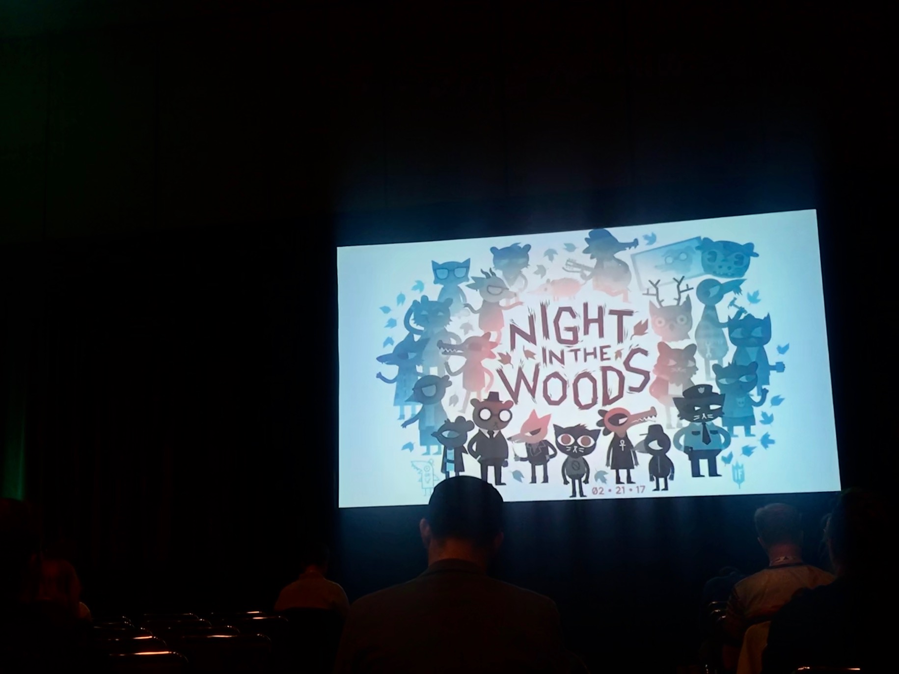
Nuke Possum Springs: A 'Night in the Woods' Design Postmortem
Scott Benson, Independent
Watch the full talk on the GDC vaultScott started off the talk by giving some history to the development of ‘Night In The Woods’ which started as a Twitter exchange between himself and Alec Holowka. This led to a Kickstarter campaign to fund the game which quickly quadrupled their initial goal.
Due to Kickstarter, the team had to make key decisions early in the process, and by putting together the materials for the campaign, the vibe of the game emerged organically. Ultimately, NITW is a game about “us”, covering diverse themes such as mental health and loss of faith. In making the game they wanted the actual game design to be minimal, favouring lots of conversations instead.
In terms of gameplay, they wanted to create the feeling of a real-life routine which is why the player must navigate the same town every day. To break up the monotony they added some platforming, and built up interest with vertical traversal.
They also developed several games within a game, something they called ‘Exceptions’. These are gameplay segments outside of the regular routine, including a “Knife Fight” between two characters, as well as the bass playing mini-game. As they wanted to avoid tutorials, the player is not given any extra information when they start the segments. While the interactions are often intuitive, not doing well is also fine as serves to further the narrative of Mae being regular and “not amazing” as Scott put it.
The simplicity of the design meant that the team could be generous with players, rewarding them for exploring and “poking”. If someone doesn’t explore, they aren’t punished, something which also creates a mystery. This makes the game beautiful, and each player has an experience unique to them.
For speech, Scott mentions that they chose the speech bubble format as they are more fun and immersive than boxes on a screen, and have no spatial separation from the character. The tools developed also support the creation of content which is key to the game. Emotion is not a feature, says Scott. Instead, the story and characters are what imbue the experience with emotion. Speaking honestly and being up front helps the game connect with people.
Classic Game Postmortem: 'Sonic the Hedgehog'
Naoto Ohshima, Arzest Corporation
Hirokazu Yasuhara, Unity Technology Japan
Watch the full talk on the GDC vaultThe talk started by stating how Sonic came to be. Historically, Sega’s approach to characters was as disposable content that would be replaced with the next game to come out. Sonic was their attempt to make a character iconic that could carry a franchise, a mascot that could compete with Mario and Nintendo.
Much of the character design was influenced by what they wanted to achieve with gameplay. The core mechanic was decided before the character, and revolved around curling up into a ball and moving with speed. Several creatures were considered including armadillos and porcupines before the hedgehog was chosen. They also knew they wanted other characters including a dog and an old man with a moustache. These ideas would eventually become Tails and Dr. Eggman.
Having an anthropomorphic lead character also meant they could transcend race and create a mascot with universal appeal. When coming up with the final design, this was based on the idea that kids could easily draw him. His colour was blue to represent Sega. The personality of Sonic also mirrored Sega. He was cool and edgy, disrupting the norm. These were all qualities of Sega itself that Sonic went on to embody.
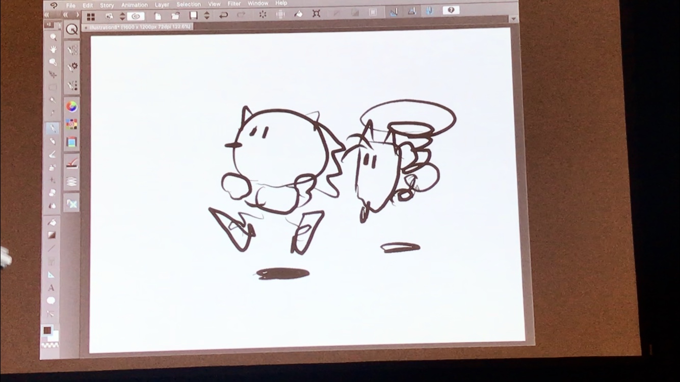
In terms of gameplay, 16-bit technology allowed the team to achieve many things that weren’t possible before. This included smooth geometry, creating a feeling of speed, and having lots of moving objects. All of these are clearly visible in Sonic. Levels were sketched initially, with Hirokazu-san developing his own simple version of Sonic to add to his level sketches. Perhaps aptly then, the session ended with Naoto-san and Hirokazu-san each drawing their versions of Sonic.
Weaving 13 Prototypes into 1 Game: Lessons from 'Edith Finch'
Ian Dallas, Giant Sparrow
Watch the full talk on the GDC vaultWhen developing ‘What Remains of Edith Finch’ the team wanted to create a game with expressive gameplay that could evoke a feeling of the sublime. Their intention was to create an experience with minimal challenge that did not rely on tutorials.
Everything should be discovered. But this is hard, says Ian. Games have trained players to experience them as life or death. They’re not used to taking their time. In ‘Edith Finch’ the team created a world for the player to explore, and gave them the tools to do this. They use context instead of story, and leave the player to wonder what might happen and really absorb the situation.
The feeling of ‘Edith Finch’ was a large component to the design, with feelings of sublime, intimacy and murky being what they wanted to capture. The team looked to other mediums to capture the feeling and decorated the office with visuals to immerse themselves. This feeling becomes the direction you want to sail, instead of making a map. This direction helped identify goals for the gameplay, namely setting scenes in nature with nested stories and explicit unreliable narrators. Over time sublime turned into overwhelmed as it was easier to make a concrete vision.
Prototyping was an important part of the process when it came to exploring feelings and finding out what the game wanted to be. Ian recommends using notecards to get ideas out of your brain and then turn these into prototypes yourself. He recommends even using a different engine so that you don’t get attached to what you’ve built. Designs usually weren’t documented as no one read them, so changes were shared through conversations, show and tells, the team playing the game themselves, and watching playtests together.
Playtests also formed a critical part of the design. People becoming lost in their imagination is one of the key parts of the story in ‘Edith Finch’ and was inspired by watching playtesters becoming lost in their own imagination when playing the prototypes. They also helped identify and remove obstacles that prevent players from enjoying the experience.
Ian closed the talk by saying you should keep making changes until the end. Only at this point you have a better idea of what you’re making, as well as the tools needed to achieve it. On that topic he mentioned three changes that came toward the end of production. Firstly, 50% of Edith’s dialog was changed a week before shipping as the team felt they understood players better. Secondly, after finishing the final room the team went back and redid the others. Only once the last room was complete did they fully understand how they wanted the others to look. The last change was the ending. This was settled on after a year of floundering thanks to a playtest with two smart designers who made the suggestion.