GDC Day One: UX Summit
April 2nd, 2018
This year I had the pleasure of attending the Game Developers Conference (GDC) in San Francisco courtesy of the wonderful Studio Gobo. This was my first GDC and I was super excited to attend and go to lots of interesting talks.
I naively wanted to write up my notes as soon as I could, but that took a bit longer than expected. On the flip side, all of the talks are now on the Vault, so you don’t need to rely solely on my sketchy notes. And of course don’t hesitate to give me a shout if I got something wrong.
After a day and a half of walking and cycling around the city, it was finally time for the Conference. The first two days of GDC are dedicated to Summits which are curated talks around specific subjects. Excitingly for me, one of those was the UX Summit meaning there were plenty of great talks to attend. Here's my recap of the talks I attended.
UI/UX for Creating Your Mobile Game in VR
Miranda Marquez, MunkyFun
Watch the full talk on the GDC vaultKicking off the UX Summit was Miranda discussing the lessons learned when taking ‘League of War’ from mobile to PSVR in ‘League of War: VR Arena’. Taking the game to VR exposed three problems around the core UX to solve: the battlefield presentation, the player's interacts with units, and UI menus. The team also wanted to make the game more accessible in order to bring in more players, given that the player base for VR is smaller than mobile.
Both the battlefield and unit interactions went through multiple iterations before the team settled on the final approach of two players standing at opposite ends of a table. This design was the confluence of many of the goals the team had, in particular making the game accessible for a wide audience, and to ensure player comfort.
When approaching UI menus, the team initially explored presenting UI in front of the player in a projector-style menu similar to the 'Minority Report'. While this presentation fit the futurist style of the game, players would become fatigued when using these menus for extended periods, either because of their arm positioning or having to turn to reach information.
As such, the team developed comfort guidelines to steer their development of UI. When using the ‘floating’, projector-style menus, interactable elements should be displayed at waist height to reduce fatigue. Informational screens shouldn’t require the player to physically rotate, instead relying on a scroll operated by arm movements.
While the mobile version of ‘League of War’ is very information-dense, when designing the VR experience, Miranda advocates for keeping UI content to a minimum. This can be achieved by removing non-essential HUD elements and not being afraid of removing things. Simplicity is key.
Good Game Design is Like a Magic Trick
Jennifer Scheurle, Opaque Space
Watch the full talk on the GDC vaultIn a talk inspired by a Twitter discussion about hidden game mechanics that went viral, Jennifer wanted to share some of the best examples in order to celebrate and contextualise some of the techniques.
Jennifer’s session covered a number of well-known examples such as Rubber Banding, often used in racing games to allow AI players to catch up no matter how far the player is in the lead, as well as Coyote Time which gives the player a brief second chance at jumping if they walk of an edge.
Following those examples, Jennifer went on to highlight why these techniques are used, often in large part as a way to be fair to players, or to convey a certain feeling.
On being fair to players, the 'Bioshock' series famously favours narrative over combat. One way they support this is by making the first shot by an enemy miss. This acts to alert the player that there is an enemy nearby and allows them to overcome the situation. Moreover, a single shot can never kill the player – this creates intense situations that the player can overcome and survive.
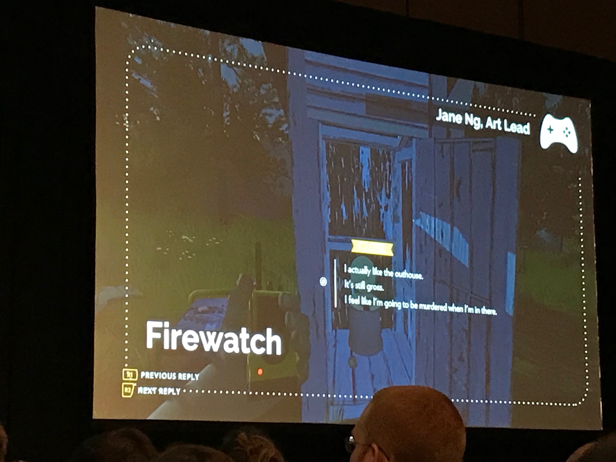
Sometimes hidden techniques can be used to convey a feeling to players. 'Firewatch' has a number of hidden mechanics within their dialog system that all support the feeling that conversations are natural. One example is imposing a time limit on choices to keep the conversation flowing naturally, so it never feels like the other character is waiting for you to respond. Though it is not surfaced as a selectable option, players can remain silent by simply not responding to dialog.

Crafting tension is an important part of game design, and hidden mechanics play a part here too. In 'Assassin’s Creed', the player’s health bar is broken into three sections which will regenerate if not fully depleted in order to encourage tactical play. To further help the player survive encounters, the final third of the bar regenerates quicker than the first two. This helps the player feel like they “just” survived.
The 'Bioshock' series also create this feeling of tension by keeping the player hungry for resources. This is achieved by dynamically adjusting resources in the environment – either removing items that the player has many of, or dropping items that they need. Similarly, if the player has lots of money, resources are removed from the level so that they are encouraged to engage with vending machines.
While there were many other techniques discussed, to illustrate the point about human perception, Jennifer closed out her talk by highlighting an example of hidden game mechanics in Hi Octane. There are several vehicles in the game from speedy-looking hover cars to hulking trucks, all seemingly with their own stats and handling. However, as the devs later revealed, they didn’t have the budget to actually implement these. This means each vehicle is exactly the same, but the look of the vehicles was enough to convince players they were different.
Max started out the talk by mentioning the UX constraints his team had at the start of the project, and how it’s good to think of these up front. For his team, these were: the existing expectations of the Halo franchise; the platform they were developing for (Xbox and PC); the team they had available; and their deadlines.
They started the project by defining the UX pillars to guide their design:
- Halo feel: The experience should highlight what people expect from Halo;
- RTS for everyone: The game should target players who wanted to get into Halo Wars, but were intimidated by the time investment, economy, base building etc.;
- Approachable but deep: For new and casual players, but still have depth for competitive players;
- Great multiplayer: Good matchmaking, custom matches etc.;
- Platform showcase: Sell the PC experience;
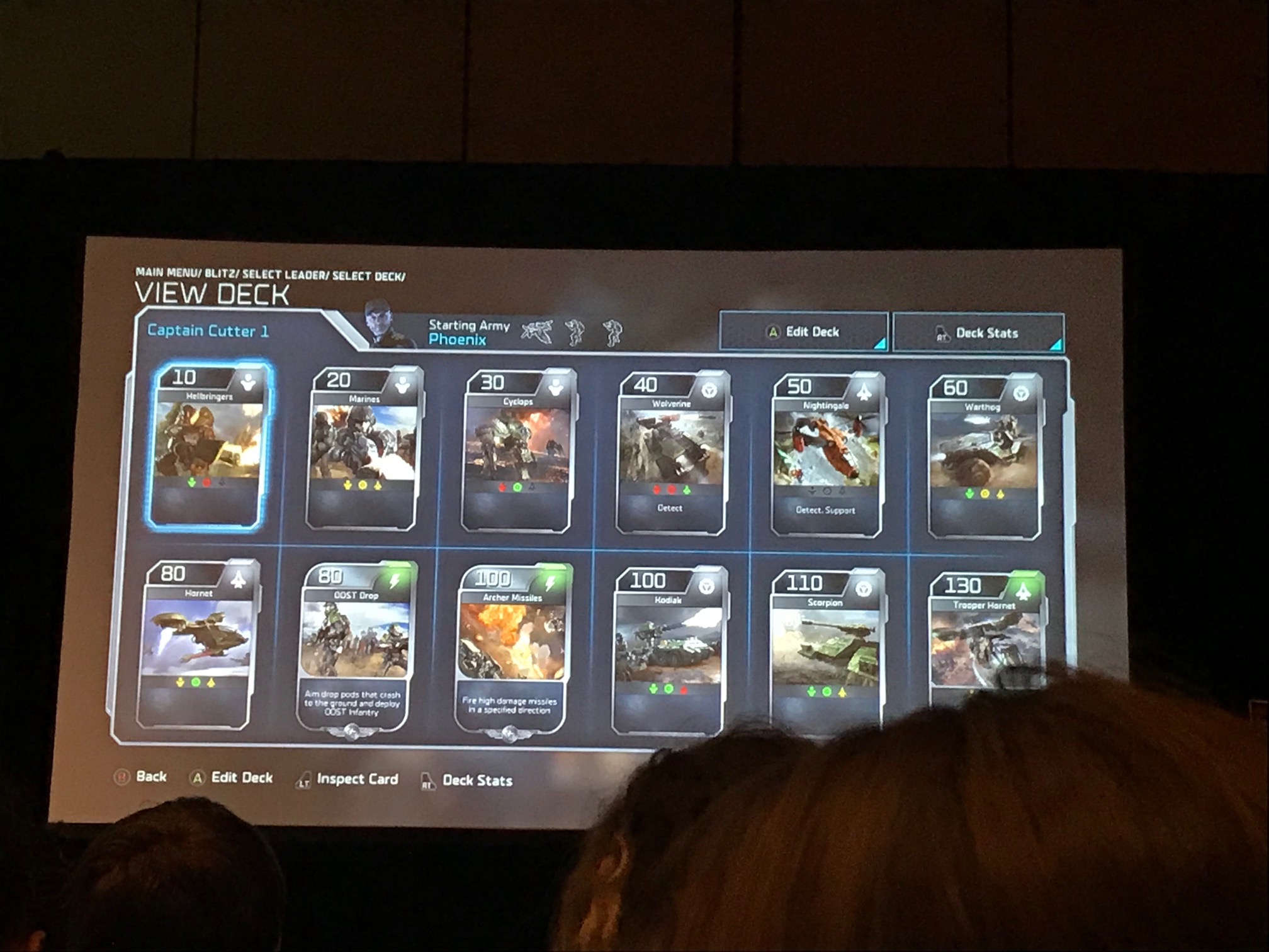
One of the ways the team approach accessibility was with the introduction of Blitz Mode, a hybrid card/RTS game. This mode had short sessions, and lots of work was put into iterating on the experience. In particular, the presentation of the cards had to convey all of the important information without overwhelming players.
Similarly, when it came to deck management the team wanted this to be simple. When exploring the initial design, the UX team found that it was quite complex. While they could have found a solution that worked, they looked to examples of similar systems in other games. In doing so, they reframed the problem and ultimately the game design was simplified.

Tradeoffs became a common theme during the project. Systems such as the Leader Powers needed to feel meaningful while still being usable during multiplayer matches. The team settled on a radial menu for the selection. While this buried some of the information and removed the sense of progression, it made the feature more useful for players.
Max’s takeaways were to know your core audience and constantly evaluate what that means in terms of the project; rethink your frame of reference when tackling problems; and embrace tradeoffs.
Immersing a Creative World into a Usable UI
Steph Chow, Steph Chow Design
Watch the full talk on the GDC vaultPeople play games for the world, said Steph at the start of her talk. People fall in love with the world and this becomes your brand. When it comes to designing UI to support the narrative, Steph has three steps: research, explore, and iterate.
When researching, ask yourself: what is the culture of the world? This can inspire UI. For instance, ‘Splatoon’ is set in streets covered in graffiti which is clearly seen in the UI, while ‘Fallout’ is inspired by dated technology. Looking into reference details can help, but Steph recommends moving beyond Google. Instead immerse yourself in the world by watching films, going to museums and so on.
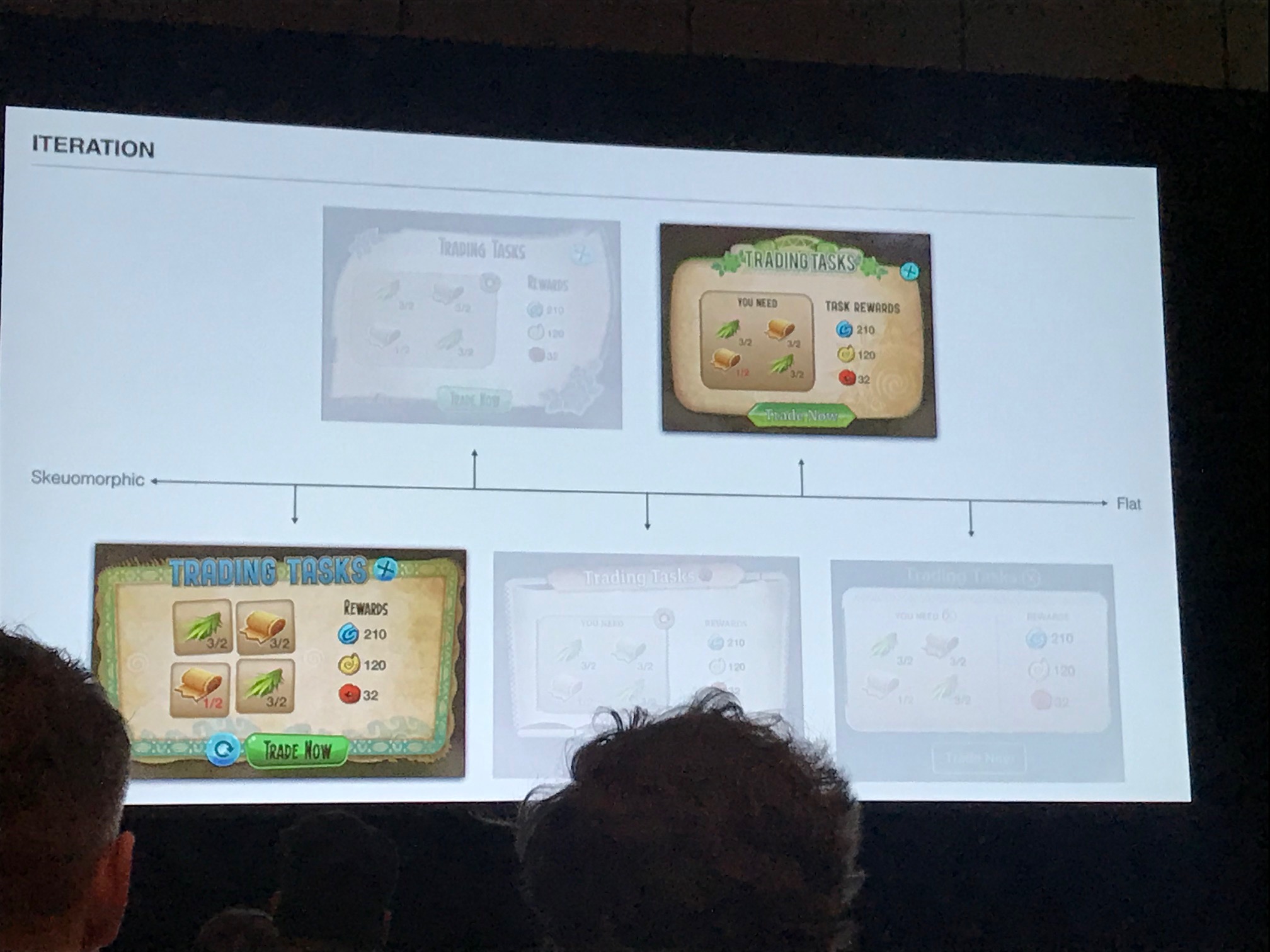
With the research done, it’s time to explore. Begin considering the spectrum of possible visuals. Think about where the UI could sit along various continuum such as diegetic or non-diegetic, flat or skeuomorphic, and explore the options.

Finally, when it comes to iteration, start narrowing the choices and think about how you balance the narrative with the UI. Importantly, consider the readability, personality, scalability, and what is implied by the UI.
Ultimately, Steph concluded, good UI should enhance the experience: reflect the world without complicating it.
The Schema is Mightier than the Sword: How Player Cognition Predicts Gaming Behavior
Vanessa Hemovich, DigiPen Institute
Watch the full talk on the GDC vaultI’ll start by saying I can't do justice to how awesome and informative this talk was so would recommend watching the recording for all of the details (and Simpsons references). That being said...
Vanessa started with some definitions: A schema is an organised mental representation of stimuli. They help streamline our processing by linking one object to another. Schemas are stored in long-term memory and differ from person to person.
We activate schemas in multiple ways. One way is through conceptually-driven "top-down processing" where we apply previous knowledge to approach a situation. Another is data-driven "bottom-up processing" where a new stimuli activates a schema.
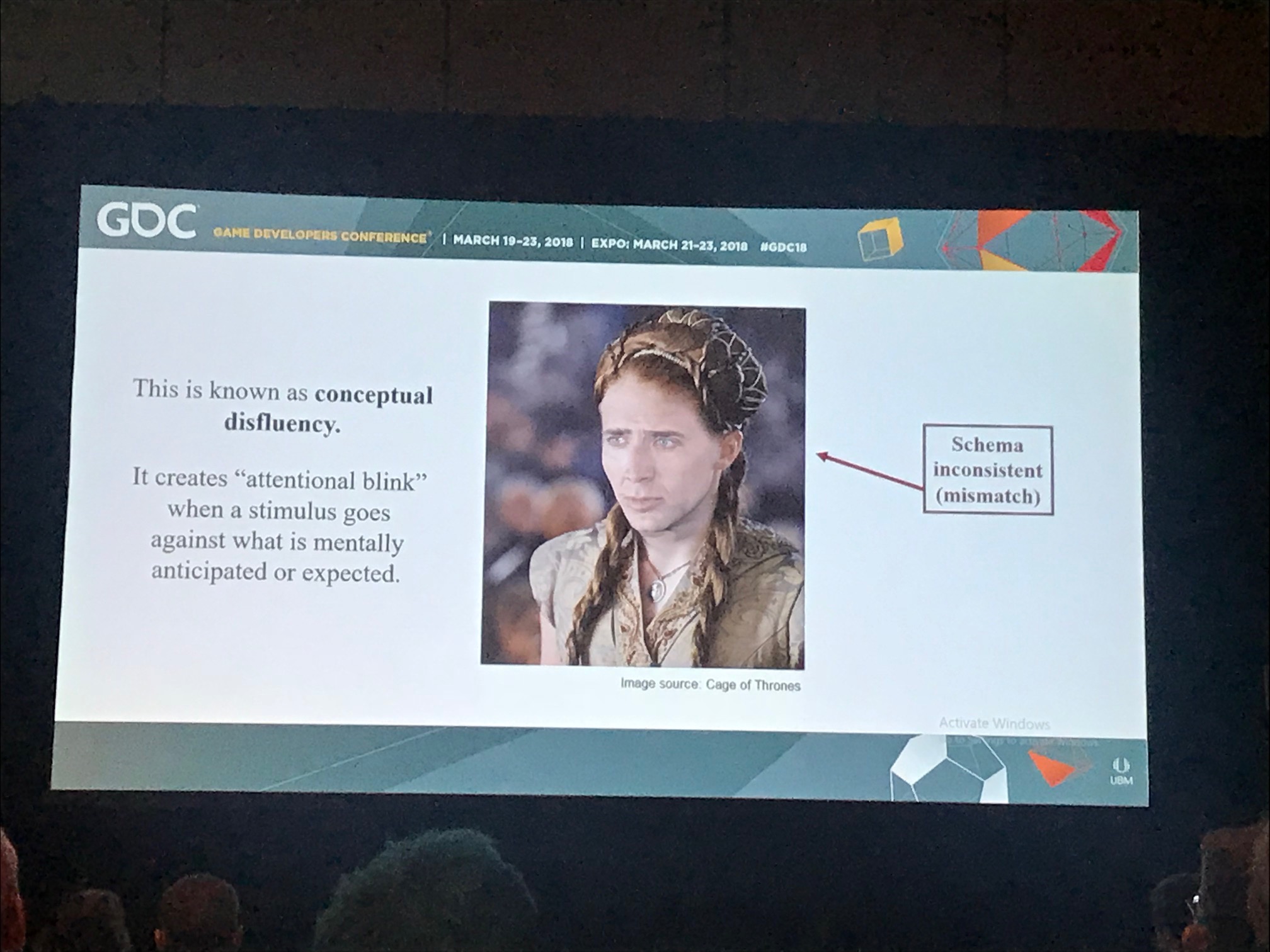
Schemas are important in predicting player attention. When a schema is matched then everything is good, for instance when the 'New Game' option is displayed at the top of game menu, and 'Exit Game' is displayed at the bottom. When a schema is violated we reject it. This creates an “attentional blink” when stimulus goes against what is mentally anticipated. We are able to recover, but shift from automatic processing to more considered processing which can break flow.

When it comes to recognition, incoming sensory info is compared to copies (templates) in long-term memory. If there's a match it will propell players forward. If there is no match, players will reliably ignore the stimuli, or avoid it completely.
We can also recognise through components, where things are made up of building blocks. Messy stimuli can still be untangled through prior knowledge. Games like ‘Limbo’ take advantage of schemas by showing part of an creature, such as the front legs of a spider, and letting the player fill in the gaps.
Configural Models allow us to still understand something even when it deviates from expectations. In the case of 'Assassin's Creed', the protagonists look and dress in a way that allow us to accept them as part of the same schema, but have the flexibility to change over time.
Vanessa summed up how schemas can be used in games. First, they help us predict how players sort and process information. Schema violation is okay, but risks making the players use controlled thinking (rather than automatic processing). Vanessa also gave some tongue-in-cheek tips if you want your game to be completely absent of flow: place the player under cognitive load, make the player stop and think, and break immersion by making players mentally stumble.
Bridging the Gap Between UX Principles and Game Design
Jim Brown, Epic Games
Watch the full talk on the GDC vaultRounding out the day was a talk from Jim Brown, who worked as a designer for 20 years before UX. Working in both roles he wanted to share the crossovers he observed between the two, highlighting three areas where the goals are shared: clarifying intent, having empathy, and providing meaning.
In terms of clarifying intent, Jim highlighted encounter design which are points of interactions with a game. As humans, we don’t see the world as it is – we interpret it using context or existing knowledge. UX helps us understand what players might do during an encounter and what their intent is.
In ‘Fortnite’, Gestalt principles of similarity and proximity are used by giving enemies visual similarities. This helps players identify which category an enemy fits into without knowing what exactly it does. Having one enemy stand out helps players to prioritise targets.
When it comes to having empathy, we can help players through environment design to maintain focus and reduce cognitive burden. Negative space reduces noise and helps the player to focus. This can be used intentionally to draw the eye to where the important action is, or guide players toward an objective.
Leveraging affordances of primitive shapes can also help guide the eye. All cover in ‘Gears of War’ had similar bulky shapes and were the same height helping players understand the rules. If something looks like cover, it is cover. If players believe they’re in cover but are taking damage, then the designers have let them down.
Finally, we as designers can provide meaning through system design. This is a significant piece of the puzzle when it comes to giving the player context and meaning. Designers should think of systems as 4D – not just what the system looks like or the balance, is but how does it affect players over time. How will players feel using this system?
Systems in ‘Fortnite’ are designed specifically to help the player find meaning. Quests show the steps needed, the rewards available, and the player’s overall progress. Achievable short-term goals are offered with extrinsic rewards which shows empathy for the player’s time, and helps the formation of long-term achievement and intrinsic rewards.

